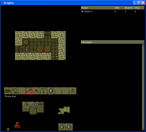
Finally I’ve got the new “action bar” control system finished. I have spent quite a lot of time polishing things, fixing bugs etc., and I’ve even drawn a couple of new icons for things that didn’t have icons in the original Knights, as you can see in the screenshot below (click to enlarge).
Note the new skull-and-crossbones icon (for suicide; there is no separate suicide key in the new system) and also the “Throw Axe” icon. As you can see, when you mouse-over an icon, it highlights in red and a text description appears telling you what the icon does. (OK, well, you can’t actually see the mouse pointer in the screenshot, but never mind.)
One thing I haven’t done is got rid of the “approaching” system. I did do some experiments in this area but decided to leave approaching in for the moment. This is mostly for reasons of time — I want to get a release out soon and I haven’t had time to finish off the “approach-less” controls yet. I might have another go at this in a future release though.
So the next priority is to get a release out so that people can test the new controls. After that, the next major step is going to be Lua scripting — both documenting what has been done so far, and then pushing to make much more of the game scriptable, so that meaningful mods can be created.
Look out for a release soon 🙂

Looks interesting. I hope the original control system can still be used though.
Indeed it can. For new players it will default to the new system, but if you’ve played before you will have to explicitly turn on the new controls on the options screen.
We’ll have to see how this goes down in places like moddb. Most newbies didn’t like the original Knights controls so I’m hoping this will be a bit more popular…