Controls, again

I have now implemented a prototype action bar (as explained in my previous post). Here is a screenshot:
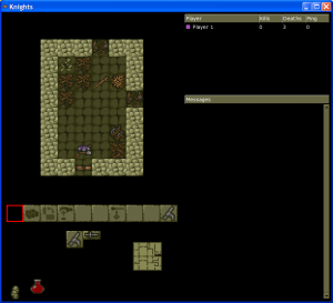
Action bar screenshot (click to enlarge)

As you can see there is a little row of action icons that can be clicked on. (Please ignore the red square on the left, that is a graphical glitch that will go away in the final version.)

After trying this out for a while, I’m reasonably happy with it. Using the mouse along with the WASD keys feels very natural (no doubt because of its familiarity from other games). On the negative side, the pure action bar system feels a bit slow to use, especially for common actions like attacking or opening doors where you don’t really want to hunt along the action bar every time.

The best system is probably some sort of hybrid, using keys (or mouse buttons) for common actions, and reserving the action bar for more rarely used actions. For example:

  • WASD = move
  • E = pick up, open door, etc
  • Right mouse button = attack

Alternatively, we could use the left mouse button (when the mouse pointer is outside the action bar area) as a “pick up” function, instead of the E key.

I tried this out briefly and it seemed to work quite well. Unfortunately I didn’t get time to go any further this weekend (I’ve had to spend some time installing anti spam measures on the forum unfortunately) but I will keep playing with it and report back on how it goes.

Controls

As I’ve mentioned before, I’m working on a new control system for Knights.

Right now, I have set up a system where you have the four movement keys, plus three separate “action” keys: one for melee combat, one for ranged combat (daggers, thrown axes, or crossbows), and one for interacting with the dungeon (which means opening or closing doors, picking up items, and the like). There is also a separate key to open the menu, which is still needed for the lesser-used actions (like setting chest traps or picking locks).

This works reasonably well, but I found it a bit confusing, especially when combined with the “approach” feature of Knights (i.e., where you have to approach a chest or door, by holding down the movement key, before you can open it).

So, I tried removing the approach feature completely. For example, to pick up an item from a chest, you now just face towards the chest, and press the interact button; you don’t have to “approach” the chest first. Similarly for opening doors. This does seem to have improved things, and is also probably simpler to explain to new players. It does lead to one or two quirks (like picking up an object in front of a door: if you’re facing the door, you can’t pick up the object, because pressing “interact” will open the door instead); but on balance, I think the advantages outweigh the disadvantages.

However, even with that change, I am still finding the new controls a bit confusing. Sometimes I press “interact” when I meant to press “attack”, or vice versa. No doubt this is just because I’m not used to it, but it’s still a bit annoying.

My brother has suggested a World of Warcraft style “action bar”. In other words, we would use WASD for movement, and then have little icons that you click on to perform actions (like attacking, opening doors, and so on). We would also allow players to map keyboard shortcuts to the actions if they wish.

I’m going to try to this out and see how it feels. If it works then it could be quite a nice system, because it means new players can use a friendly mouse-based interface, while experienced players can still use keyboard controls if they wish. It also means we can get rid of that irritating 4-way menu once and for all 🙂

Controls are an important thing to get right, so I’m going to keep experimenting until I get something that feels right. I don’t know how much more time that is going to take; but I’ll try to keep people informed via this blog.